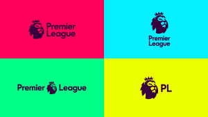
The Premier League has gone through a visual rebrand that is sure to surprise many. For the first time they have ditched their current emblem that has been in place since 1992.
“The badge” is being launched at a time when the Premier league doesn’t have a sponsor ( for the first time in its history). Even without mentioning it, it’s clear that the new bade was designed with digital presence in mind, shifting the organisation into a new direction.

The task of this redesign belonged to Designstudio. CEO Paul Stafford had this to say;
“Lots of people around the world understood that lion to represent the Premier League … so it wasn’t about destroying everything that was there to build something new, it was about building on that equity and heritage,”
And right he is. The Lion has become a major symbol for the league making it one of the most noticeable brands which is broadcast in 212 territories so moving away would not have been a feasible idea.
Final thoughts
Being a brand that is easily accessible digitally is clearly on their mind. From the minimalistic rebrand it’s clear that screen of all sizes play a factor in how the premier league want there content to be consumed in the future. What we’re seeing is the first of many changes that the Premier league will go through in order to have a stronger digital presence.

